New look!
My home page has been restructured a redesigned. One interesting new feature is a blurred version of the teaser image as background.
What is new?
- Materializecss: The page does not use bootstrap and darkstrap anymore, but is now built upon materializecss with a custom dark theme.
- Blurred teaser image as page background: The page’s header now features a blurred version of the teaser image. Since CSS3 blurring is quite expensive concerning performance, the blurred image is generated using an automated preprocessing step.
- Automatic table of contents: I added a small Javascript snippet which will add an entry to the table of contents on the right for each
<h1>and<h2>tag.
$("h1,h2").each(function(i) {
  var id = $(this).attr("id");
  var html = "<li><a href='#" + id + "'>" + $(this).html() + "</a></li>";
  $("#toc").append(html);
});- Restructured site: The landing site of the home page is now the blog. Google analytics has shown that many users were confused by the accordion on the landing page.
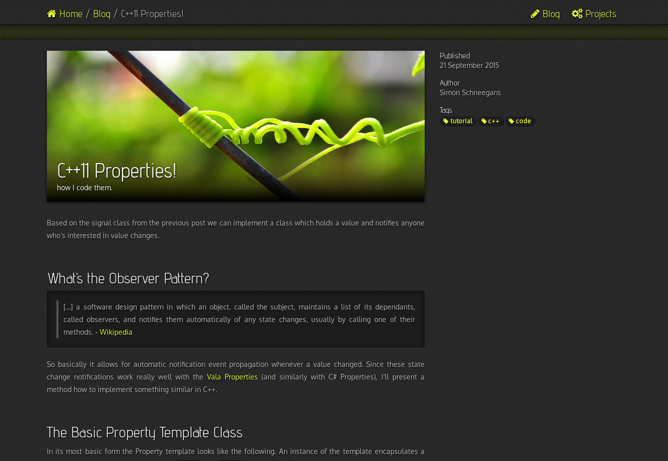
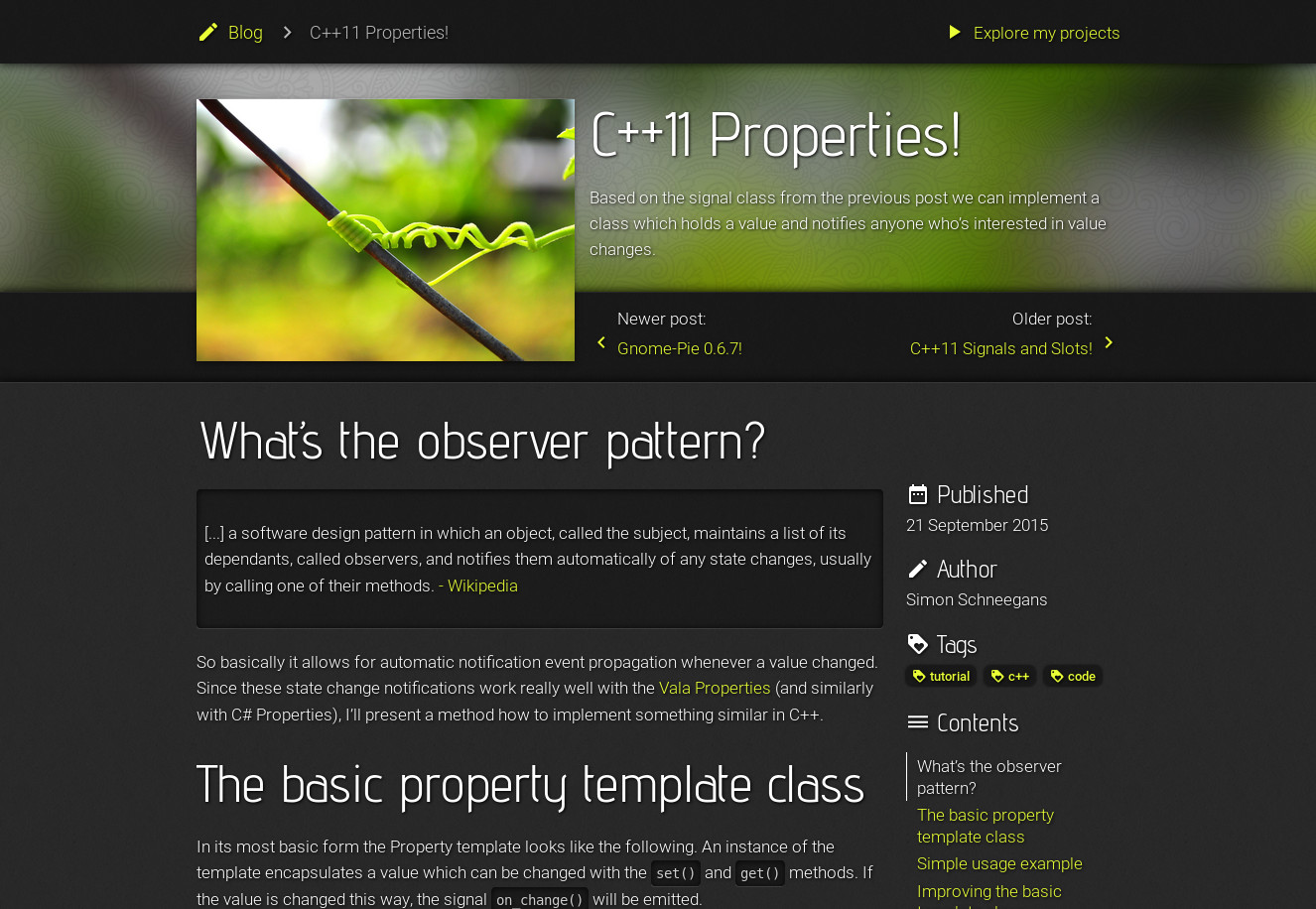
- Improved post layout: The layout of the post page has been refined. Here is a before-after comparison.


Before
After
How does the blurring work?
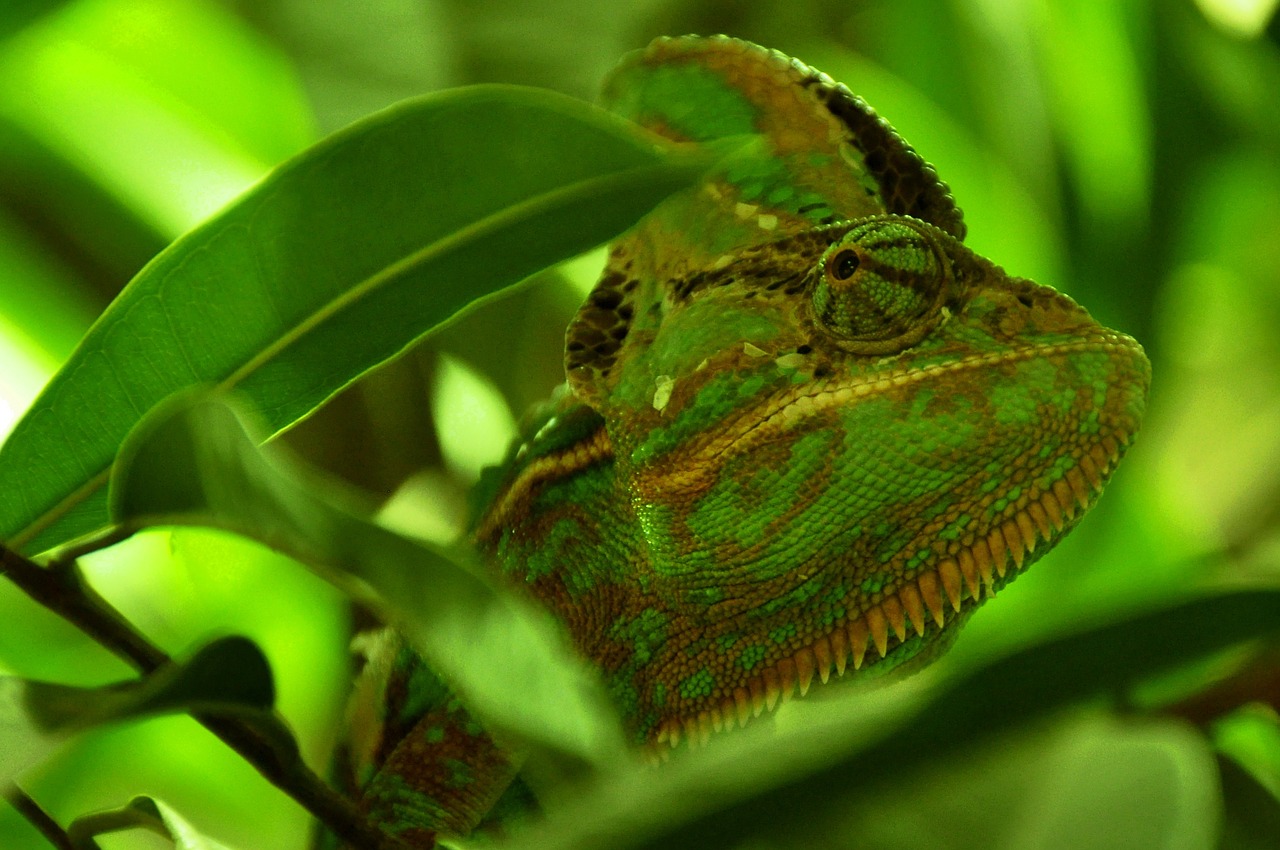
As part of the build process, a script creates a small blurred version of all teaser images. It uses image-magick’s convert to create the image with the following command:
convert -geometry 250x -blur 0x5 chameleon.jpg blurred_chameleon.jpg

The original teaser image.
The blurred image.
Using the following style information to the body element will set the blurred image as background for each page.
<body class="{{page.colors}}"
      style="background-image: url(/img/blurred/{{page.teaser}});">
  ...
</body>