Bachelor thesis!
And finally it’s done. After some months of hard work I’m now a Bachelor of Science! I passed with distinction and since many of you helped me by sending in your usage statistics of Gnome-Pie, I owe you many THANKS and a summary of what I achieved. You may just read the abstract and look at the pictures, graphs and videos to get a glimpse of the results or (if you’re brave and greedy for knowledge) you may read the entire summary.
Abstract
Compared to conventional menu forms, Pie-Menus offer some unique opportunities. Due to their radial layout they provide both: a high efficiency and a high effectivity. Furthermore, they give the possibility of a continuous learning curve, which results in great user satisfaction.
Besides these obvious advantages there are some unresolved problems which hinder their ubiquitous appliance. Especially there is no existing implementation which is able to display menus with a deep and wide hierarchy. During the course of the thesis two Pie-Menus have been implemented which resolve this challenge.
A user study showed, that both innovated Pie-Menu types have a higher usability than common linear menus once the position of the desired menu entries has been learned by the user. Both types fail when the user has to search for an unbeknown entry.
1. Analysis of existing Pie-Menus
An incredible variety of Pie-Menus has been developed for numerous reasons. For the thesis I compared many of them and categorized their strengths and weaknesses in order to develop new Pie-Menu forms. One Pie-Menu I checked in detail was, obviously, Gnome-Pie.
1.1. Gnome-Pie
Gnome-Pie was created in order to bring Pie-Menus to the Linux desktop. It is not able to display hierarchies properly but does a good job when there are many items in one menu. This is mainly a result of its icon-based approach to Pie-Menus. There are no labels which clutter up the screen. The evaluation of the statistics of 150 users who did nearly 30.000 selections with Gnome-Pie revealed some interesting details. In contrast to some related user studies, selection time for individual items does not increase significantly when there are many items in one pie. The chart below indicates a rising selection time when there are more than twelve items in one pie, but these figures have to be treated with caution, as only a few users configured pies with that much entries.

Selection performance in Gnome-Pie is generally high. The mode of selection is 1.4 seconds which is quite fast, particularly considering the real-world circumstances of this study: the users were not told to operate the menu as fast as possible. I was surprised by the humble amount of quick-actions used - only a few users employed them at all. And those who did, were only slightly faster. They achieved a mode of 1.2 seconds. This is interesting, as the pointer does not have to be moved at all in order to select a quick action!

Additionally to Gnome-Pie I evaluated many other Pie-Menu concepts and structured their benefits and drawbacks. None of them was able to display both, wide and deep menus. This is necessary to compete with conventional linear menus, which are slow to operate but are able to do both.
1.2. Advantages of existing Pie-Menus
Pie-Menus may have a high degree of usability. Thus they are efficient (fast to operate), effective (not error-prone) and funny (users like them - they get a feeling of success while learning). They are efficient because of the implementation of Fitt’s law, which
[...] is a model of human movement primarily used in human–computer interaction and ergonomics that predicts that the time required to rapidly move to a target area is a function of the distance to the target and the size of the target. - Wikipedia
For the same reason they are effective. But by far the most remarkable advantage is their continuous learning curve. Users may become extremely fast just by using the menu. Every time they make a selection, they get faster and more accurate. At some point it is not necessary to read the labels anymore, because the user remembers the direction of an entry. With “normal” linear menus that is not possible. The maximum selection speed with a mouse is very limited and soon obtained. The only possibility of getting an expert is learning a hot-key. But these are not a solution:
- Hot-keys are hard to learn as there is often no relation between the performed action and the according key. (Why is something pasted with Ctrl-V? Why is undo Ctrl-Z?)
- When the number of hot-keys increases, they become hard to articulate. In Blender I often use Shift-Ctrl-Alt-F (select similar aligned faces) - try to do this with one hand!
- Hot-keys have to be learned on purpose. The user must make the decision to learn the hot-key. Many users never do this step.
- When a user decides to learn a hot-key his knowledge on the position of the entry in the menu gets useless. He has to acquire knowledge from a completely new domain.
Pie-Menus offer a beautiful solution to this problem. They are fast enough to render most hot-keys unnecessary. But as mentioned before, there are some tricky problems which need to be solved in order to make them suitable for a larger audience.
1.3. Disadvantages of existing Pie-Menus
Every implementation I looked at suffered from some problems. For example Gnome-Pie is not able to display hierarchies properly. The last pie is simply replaced by a new one. There is no way for the user to check whether he has clicked on the correct entry, there is no obvious way to navigate back again and there is no possibility to peek into a sub-menu without activating it. Furthermore Gnome-Pie is limited to icons - it is hard to put actions into a pie which can not be represented by an unique glyph (e. g. what would be a good icon for selecting Unicode character encoding?). This problem may be solved by displaying captions for each slice but these are hard to read when there are plenty arranged in a circle. It boils down to two major problems:
- Most existing Pie-Menus are not able to display many items in a proper way.
- Most existing Pie-Menus are not able to display hierarchies a proper way.
The goal of my thesis was to develop Pie-Menus which provide a solution for both problems at the same time. I will describe the prototypes I implemented in the next chapter.
2. Development of new prototypes
Both prototypes were coded with Vala on Ubuntu Linux. The source code can be downloaded from Github. The prototypes are able to display a custom (hard-coded) menu structure which can be explored interactively.
2.1. The Coral-Menu
The first prototype is targeted at users who often search for items due to their manifold menu usage. It displays hierarchies with ease. Even very deep hierarchies are easy to explore. Many items are displayed by increasing the pie’s radius and stacking the labels which are displayed next to their sector on top of each other. The following clip demonstrates the behavior. As you can see, the items of sub-menus are indicated by little dark blobs at their parents. This menu is quite fast to use because of the mouse making a smooth movement.
2.2. The Trace-Menu
The second prototype addresses itself to users who often make use of the same menus. Thus they know where to find an entry and want to select it blazingly fast. In contrast to the Coral-Menu each sub-menu is a complete 360-degree-Pie-Menu with one entry being the parent menu. The hierarchy is visualized by a path between the visited menus. This menu features a so-called “Marking-Mode”: The user may draw the path (the “trace”) to the desired entry with one continuous gesture. Watch the following clip and you will understand this behavior - the Marking-Mode is used for the very last selection.
The visualization of wide menus is not shown in this clip. For this purpose the Trace-Menu generates artificial sub-menus when there are more than eight entries at one level. These sub-menus are labeled with all contained items. In order to select an item, the user first selects the generated sub-menu which contains the desired item and secondly selects the item itself.
3. Testing of the prototypes
For comparison of the prototypes with a baseline I also implemented a common linear menu. 29 people were involved in a user study which revealed some interesting issues.
3.1. Test setup
The participants were split into two groups. Both groups were introduced to the prototypes until they felt comfortable with the menu types. The first group had to search for entries in random menus with varying breadth and depth. Afterwards they had to select specific targets many times consecutively.
The other group learned those targets under more natural circumstances: during six training sessions distributed over multiple days they had to select them in a random order.
When the participants were finished with their tests, they were told to fill in a questionnaire and got rewarded with cookies.
3.2. Result
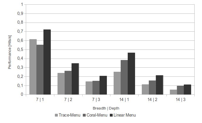
When unknown entries had been searched, the linear menu remained the fastest. As shown in the figure below, both prototypes perform similar in narrow menus. They reach approximately 75 % of the performance of linear menus. When the menus get wider, the performance of the Coral-Menu rises to 80 % and the Trace-Menu drops to 55 %. This indicates that the implementation of wide menus is better in the Coral-Menu.

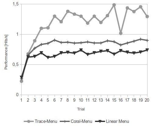
When the same entry is selected multiple times, the situation is flipped. After eight or nine selections (graph below) the Trace-Menu performs twice as good as the linear menu. The Coral-Menu is roughly 25 % faster than the linear menu when selecting well-known items. Due to the unnatural circumstances these numbers are suitable as a upper limit which may be reached by real experts only.

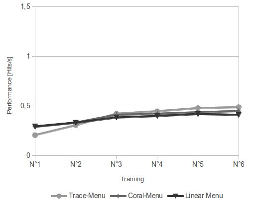
Very interesting is a comparison of these figures to the control group which selected the same entries in multiple training sessions. The trend of the curves is similar. But the differences between the menu types are much lower and the achieved performance level is only half. At the end of the sixth training, members of this group had selected each entry 30 times.

4. Summary
What do these results tell about the ubiquitous appliance of Pie-Menus on today’s desktops? Which design issues of the prototypes need to be fixed in further iterations?
4.1. Consequences for the prototypes
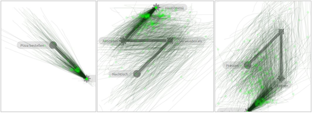
Both prototypes were mostly used as intended. During the test I recorded the mouse movement of the participants. The results are displayed below. It is clearly visible that users of the Coral-Menu did not try to click on the captions of each slice. They clicked on the sectors belonging to each item. Trace-Menu-Users employed the Marking-Mode quite quickly. They tended to draw the mark a little bit towards the label of the item which might result in errors if the label is very long.


But there are some design issues which need to be fixed. The biggest problems of the Coral-Menu are:
- Unfolding delay: For now, there is a delay of 250 ms before a sub-menu is unfolded. This hinders a quick and smooth mouse movement.
- Hiding of entry labels: In order to reduce screen-cluttering labels of entries which are not part of the current menu are hidden. That used to confuse users.
- Bad visibility of sub-menus: Some users complained about not instantly to know which entry contains sub-menus.
The Trace-Menu may be improved as well. The test results revealed these weaknesses:
- Visualization of artificial sub-menus: If an item is in a wide menu, users have to search it twice: Once they have to find the sub-menu containing the item, then they have to search it again inside this menu. This results in the very bad search performance of the Trace-Menu in wide menus.
- Backing up while in Marking-Mode: Many users requested a way to abort or navigate back in the Marking-Mode.
4.2. Test results
Both prototypes are extraordinary innovative Pie-Menus which are able to display deep and wide menu structures. Nevertheless they suffer from major performance issues when an unknown items has to be searched for. That is a remarkable drawback since many menus are used rarely.
In addition, the results suggest that in everyday situations, users seldom realize the full potential of a system. The concentration that is necessary to perform selections very quickly in menus, is disproportionate to the few milliseconds, which can be obtained from such use. This finding does not mean that there is no point in constructing a theoretical fast system. Only is the performance gain that is achieved in practice, not comparable to the results of a study under controlled conditions. For this reason, the actual performance of Pie-Menus and their linear counterparts under real conditions are much closer than it had been suggested by theoretical considerations.
4.3. Future work
A major result of the work is the Trace-Menu. Although the analysis of the results has shown that it is not suitable for the complete replacement of linear menus, it is nevertheless wherever entries are commonly used, a remarkable improvement of traditional Pie-Menus. Employed in the right application, it dwarfs linear menu’s performance while providing more flexible display options than existing Pie-Menus.
I will implement a new way of displaying menu hierarchies in Gnome-Pie in the near future. The style will we similar to the Trace-Menu as it showed by far the best results. Additionally I plan to create such a menu for Blender. Maybe it is time to create a possibility to embed Gnome-Pie into other applications…