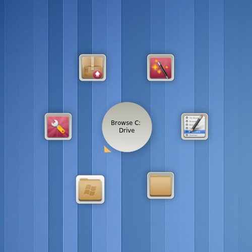
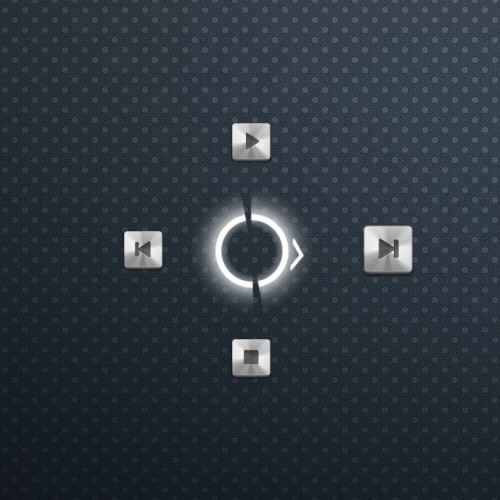
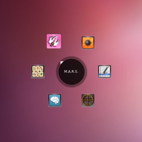
Create a theme for Gnome-Pie!
It is quite easy to create custom themes for Gnome-Pie. All you need to do is creating some images and editing an XML-file to make the theme behave as you want. With this little tutorial I’ll give an overview of the steps needed to create a theme.
Themes of Gnome-Pie
The themes of Gnome-Pie are either installed to /usr/share/gnome-pie/themes or /usr/local/share/gnome-pie/themes - you can have a look at these to get an impression.
When you create a new theme you should put it in your home directory in ~/.config/gnome-pie/themes, there they’ll discovered as well.
1. Decide what you want
This step might be difficult if it’s your very first theme due to your limited knowledge on what is possible with the themes of Gnome-Pie. Therefore I list some possibilities and restrictions here:
- Each theme consists of an arbitrary amount of image layers for the center and the slices of a pie.
- An image can be in various formats (svg, png, jpg, …) and sizes. But it is best if all images are svg’s. These are very small in size and can be scaled without any artifacts.
- Slice layers have two states: when the mouse hovers over a slice, this slice is active else it is inactive.
- The same applies to center layers: when any slice of the pie is hovered, the center is active. If no slice is hovered (e.g. the mouse is on the center of the pie), the center is called inactive.
- Depending on it’s state, a layer can behave differently.
- For center layers you can specify its rotation speed, rotation mode, colorization and scale.
- For slice layers you can specify its colorization, opacity and scale.
2. Draw the necessary images
This can be done with the image manipulating application of your choice. For svg’s this probably will be Inkscape, if you decide to use another image format, the Gimp may be a good choice. I won’t get into detail how to draw those images, but I’ll post the images used for an old version of the theme “Adwaita” as an example.


3. Create a theme.xml file
If you have your images, they need to be combined to one theme with an theme.xml file. Place all your images in the directory ~/.config/gnome-pie/themes/name_of_your_theme. You may have to create this directory if it doesn’t exist. Then create a new file in this directory called theme.xml.
The basic structure of this XML document is as follows:
<?xml version="1.0" encoding="UTF-8"?>

<theme>
    <pie>
        <center>
            <center_layer />
            ...
        </center>
        <slices>
            <activeSlice>
                <slice_layer />
                ...
            </activeSlice>
            <inactiveSlice>
                <slice_layer />
                ...
            </inactiveSlice>
        </slices>
        <caption />
    </pie>
</theme>
Remember, there can be an arbitrary amount of layers! The order of the layers in the XML file specifies how they are painted on top of each other. The first layer will be the bottom-most, succeeding layers will be painted on by one on to each other.
The most basic, working theme without any images looks like that. Maybe you can use this as a base and start experimenting!
<?xml version="1.0" encoding="UTF-8"?>

<theme name="Simple" description="The simplest theme" author="Simon Schneegans" email="code@simonschneegans.de">
    <pie>
        <center>
        </center>
        <slices>
            <activeSlice>
                <slice_layer type="icon" />
            </activeSlice>
            <inactiveSlice>
                <slice_layer type="icon" />
            </inactiveSlice>
        </slices>
        <caption />
    </pie>
</theme>
For each element there are some attributes which can be specified. Not all of them are necessary, the following is a complete list as reference. On the right side there is the default value. Each element with a default value is optional, all others are marked as mandatory.
The <theme> element
Element | Default value |
|---|---|
| author Your name | mandatory |
| description Description of the theme | mandatory |
| email Your e-mail address | mandatory |
| name Name of the theme | mandatory |
The <pie> element
Element | Default value |
|---|---|
| fadeInRotation Initial rotation when opening a pie | 0.0 |
| fadeInTime Time for opening animation | 0.2 |
| fadeInZoom Initial zoom-factor when opening a pie | 1.0 |
| fadeOutRotation Final rotation when closing a pie | 0.0 |
| fadeOutTime Time for closing animation | 0.1 |
| fadeOutZoom Final zoom-factor when closing a pie | 1.0 |
| maxZoom Zoom factor for hovered slices | 1.2 |
| radius Radius of the pie in pixels | 150.0 |
| springiness Bouncy-ness of all animations | 0.0 |
| transitionTime Global animation speed | 0.5 |
| wobble Amount of slice distortion | 0.0 |
| zoomRange Area around the hovered slice which is zoomed | 0.2 |
The <center> element
Element | Default value |
|---|---|
| activeRadius Radius until the center becomes active | 45.0 |
| radius Radius of the center in pixels | 90.0 |
The <center_layer> element
Element | Default value |
|---|---|
| [in]active_alpha Opacity of this layer | 1.0 |
| [in]active_colorize Whether this layer should be colored according to the currently active slice | false |
| [in]active_rotationMode Possible values: auto (turns endlessly around), turn_to_active (the image is rotated so it faces with its right side the currently active slice), turn_to_mouse (the image is rotated so it faces with its right side the mouse) | auto |
| [in]active_rotationSpeed The speed of any rotation of this layer | 0.0 |
| [in]active_scale Scale factor of this layer | 1.0 |
| file Image file used for this layer | mandatory |
The <slices> element
Element | Default value |
|---|---|
| minGap If the gap between adjacent slices becomes to narrow (due to the pie being full of slices) the entire pie will expand | 14.0 |
| radius Radius of a slice in pixels | 150.0 |
The <slice_layer> element
Element | Default value |
|---|---|
| colorize Whether this layer gets colorized according to the icon of this slice | false |
| file If type is file: the image file to use, is type is icon: a mask - the icon will be visible at the non-transparent parts of this image | mandatory if type="file" |
| scale Scale of this layer | 1.0 |
| visibility Can be set either to with_caption, without_caption or to any. The layer will be shown or hidden according to caption visibility selected in the user's preferences. | any |
| type Type of this slice layer, can be one of the following: file (an image file), icon (the actual icon of the slice is placed at this level of slice) or caption (the name of the slice will be written here) | file |
| x Horizontal position offset of the layer | 0.0 |
| y Vertical position offset of the layer | 0.0 |
| color Only for type caption: Color of the font | #FFFFFF |
| font Only for type caption: Font of the caption | sans 12 |
| height Only for type caption: Maximum height | 100 |
| width Only for type caption: Maximum width | 100 |
4. Post a screenshot in the comments


If you created a theme you’re happy with, share it! Please post a screenshot or the entire theme in the comments! I’m very pleased to include new themes in future releases of Gnome-Pie!
Happy theming!